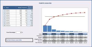
You hear about this rule all the time from management, human resources and just about any business guru you can think of, so what exactly is it and how do you use it? The Pareto Chart, based on the Pareto Rule (commonly called the 80/20 rule), is an economic distribution principle named after Italian engineer Vilfredo Pareto, which showed 80% of land wealth was held by 20. Business has adopted this principle to say that 80% of the problems are caused by 20% of the people.
What you need to know
The Pareto Chart measures specific data in broad concepts and puts the information into a summary you can interpret a little easier. If you want to measure how often a process stalls or how many times red comes up in a sea of blue, then this is the method for you. When you use this method, before you begin you should decide how you want to group the items you’re measuring and how that measurement will happen. Ask yourself, am I measuring by weeks, days or hours? This distinction will make a difference in your results so you will need to find the most appropriate one.
When you should use it?
You should use the Pareto Chart when you are trying to find the frequency of something, say how often customers return a specific product or the reasons why the product is delivered late.
What a Pareto Chart looks like:
When you’ve gathered your data, you will use that information to create a Pareto Chart. An example of what a Pareto Chart might look like is below.
There are more steps involved in creating a Pareto Chart, but this post should give you some insight into what it is used for and why it is used.


